graphik impakt 2011
poster design
|
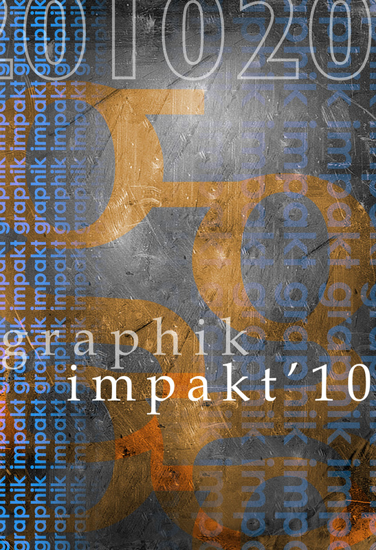
Each student will begin by browsing through the inspiration galleries that I have assembled for you… while each poster you see there won’t fall within the exact rules you will be following for your project, look more closely at how that particular designer used typography as a form to create other shapes and relationships within the design with letters.
Make sure to study closely how the artists & designers used color, texture and pattern in each one, and let your self be inspired to create a design that strives to make the same artistic impact. This project will emphasize one of the greatest strengths of Adobe Photoshop, in the way that you overlap and overlay your layers. |
 |
instructions
1. Each student will only be able to use colors from one of their color sheets. You may use any of the colors inside of the gradient you created at the bottom of the color sheet, plus black, white, and any value in between (the entire gray scale).
2. You will set the document up in Photoshop with a size of:
13 inches X 19 inches, and a resolution of 300.
3. You may only use letters found in the words “Graphik Impakt,” and numbers from 2011. You may repeat letters and numbers, and you may use any fonts available to you (wisely).
4. A selection of the posters will be chosen to become the advertisements to promote this year’s Graphik Impakt show, our annual graphic design show.
5. For this project, you will be incorporating textures retrieved from the internet, as well as patterns and objects created in Adobe Illustrator. Remember how you dragged your portrait from Illustrator into Photoshop… you have tons of great options available to you in Illustrator that you can incorporate straight into your design in Photoshop, so don’t forget about those.
when finished
Just like you did with the previous photoshop assignments, you must always go to the LAYER menu, and choose FLATTEN IMAGE. You will always want to keep a .psd file for yourself so that if you need to go in and correct a mistake on a particular layer, you can do so. The file you are sending is the flattened version, and you are saving it as a .jpg file... REMEMBER, when you change the format to .JPG, if it doesn't automatically attach the .jpg, you must type it in. The file name you are sending me should be named "YOUR LAST NAME_POSTER.JPG."
