figure & ground
negative vs. positive space
Figure and ground...negative and positive space. From the onset, these terms seem straightforward and relatively easy to understand. For the most part this is definitely true, however, the same cannot be said of a designer’s ability to fully utilize this principle in the same way he/she may talk about it. It is one thing to understand the definition, and another thing entirely to be able to use it to its full potential. In nature, what we see all around us is often revealed by the object itself—its shape, size, color etc. In essence, to do so is to only recognize the object in complete disregard to everything else around it. The idea that an object has no relation to everything else around it is an incomplete notion…an object only takes shape once a contrasting ground is placed near or behind it. If you hold your hand up in front of your face, try looking at the space that surrounds it…is the space that isn't occupied by your hand not just as important in defining the area as the physical space your hand does in fact occupy? Figure/Ground relationships may be one of the easiest principles to identify and define, maybe one of the easiest to talk about. However, it is without a doubt one of the hardest to use effectively and efficiently.
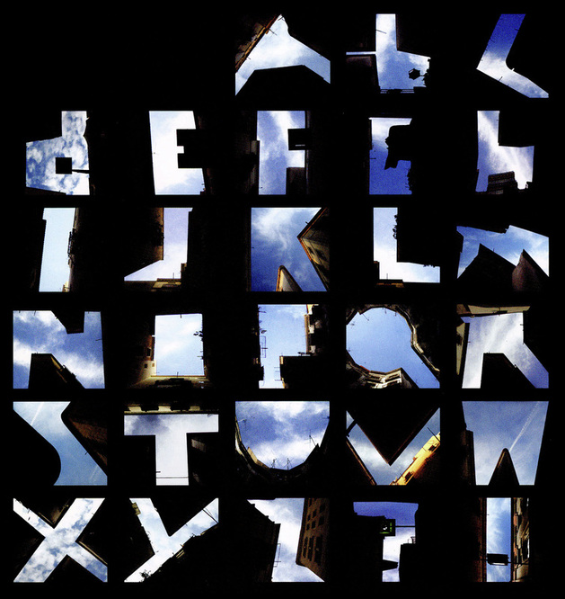
Figure Sky. These photographs use urban buildings to frame letterforms. The empty sky becomes the dominant figure, and the buildings become the background that makes them visible. Lisa Rienermann, University of Essen, Germany.
In this project, we will be creating 3 unique pieces with one accompanying piece, making a total of 4. Again, there are very specific guidelines, so make sure you read through all of the directions first.
The guidelines are as follows:
Begin by sketching out your ideas. There is no benefit to choosing a word with very few letters. Keep in mind, you will have to come up with three COMPLETELY UNIQUE compositions, so if you choose the word ‘blue,’ you will have to figure out how to make 3 compositions with those 4 letters that are both creative, and completely unique from each other. On the other hand, if you choose the color ‘aubergine,’ you will have to use every letter at least once throughout your three compositions…as you can see, both long and short words support different challenges in their own right.
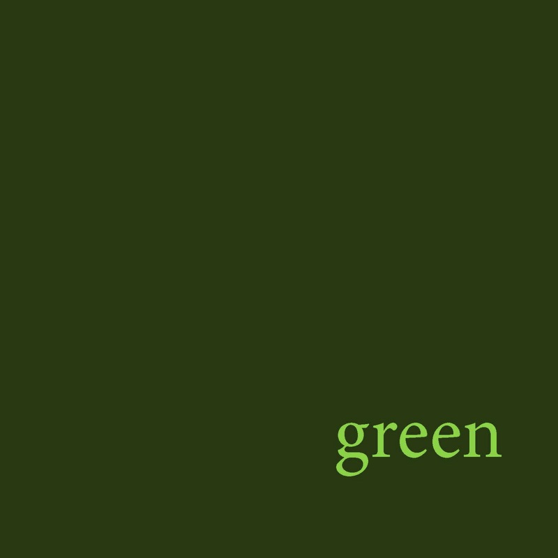
Next, create the piece that comes first in the series...the one with just the word of the color (Refer to my example). You are to setup your document at 8 inches by 8 inches with a RGB color profile. This one may have any composition that you like, but will only use the two colors that you have chosen, along with the word. Before you move on, you must get the color selection approved first.
Lastly, once you have had your sketches and color choices approved, you may begin in illustrator. You will keep one illustrator file that houses all of your designs in it, and you can name that anything you like. However, each one will be sent to me as a PDF titled:
“YOUR LAST NAME_FIGURE.GROUND 1, 2, 3, etc.”
Again, DESELECT the box in the final dialogue box that says “preserve Illustrator capabilities…”
The guidelines are as follows:
- You are to choose 1 color (any color)
- You can only use the letters that spell out the color you have chosen
- You have to use every letter at least once, but can use that letter in more than one piece if you choose to, as many times and as many different ways as you want
- You can use as many type settings/fonts of your choice
- You can only use two extreme values of the color you have chosen (as with my example)…NO MID-TONAL RANGES.
- All three compositions are to be completely unique looking
Begin by sketching out your ideas. There is no benefit to choosing a word with very few letters. Keep in mind, you will have to come up with three COMPLETELY UNIQUE compositions, so if you choose the word ‘blue,’ you will have to figure out how to make 3 compositions with those 4 letters that are both creative, and completely unique from each other. On the other hand, if you choose the color ‘aubergine,’ you will have to use every letter at least once throughout your three compositions…as you can see, both long and short words support different challenges in their own right.
Next, create the piece that comes first in the series...the one with just the word of the color (Refer to my example). You are to setup your document at 8 inches by 8 inches with a RGB color profile. This one may have any composition that you like, but will only use the two colors that you have chosen, along with the word. Before you move on, you must get the color selection approved first.
Lastly, once you have had your sketches and color choices approved, you may begin in illustrator. You will keep one illustrator file that houses all of your designs in it, and you can name that anything you like. However, each one will be sent to me as a PDF titled:
“YOUR LAST NAME_FIGURE.GROUND 1, 2, 3, etc.”
Again, DESELECT the box in the final dialogue box that says “preserve Illustrator capabilities…”


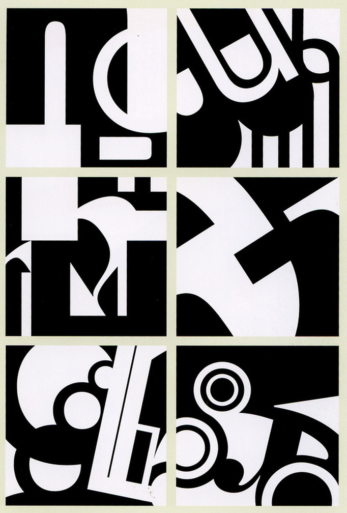
Project created for Typography 1. Jennifer Cole Phillips, faculty. In order from top left down, and followed by top right down: Zey Akay, Anna Eshelman, HuunSoo Lim, Lindsay Patrick, Elizabeth Tipson, Lindsay Patrick
Works Cited
Lupton, Ellen & Jennifer Cole Phillips. Graphic Design, The New Basics. New York, Princeton Architectural Press, 2008.
Lupton, Ellen & Jennifer Cole Phillips. Graphic Design, The New Basics. New York, Princeton Architectural Press, 2008.
