Basic Color Terminology
An extremely important aspect of Graphic Design is color. In the world of art, color is of monumental importance. Believe it or not, some people make their entire careers around the business of color. There are actually professionals called ‘color specialists,’ that are hired to come in and consult around the concept of color for certain projects.
Having said this, you will all be getting a pretty brief introduction to some basic terminology and concepts. The purpose and the importance of this information is in the way that we speak about our work, as well as how to combine colors in a deliberate and concise manner. For example, when you are speaking about your designs, you should be able to describe your color choices as ‘less saturated, or darker values,’ rather than just lighter or darker.
In reference to combining colors, we should all be completely aware of how colors interact with each other, rather than what you just think ‘looks cool together.’ Below we have terminology paired with a graphic illustration. These resources are instrumental in your coming projects, so you need to be very familiar with it. Be aware: you are going to be tested on everything you see below… know it!
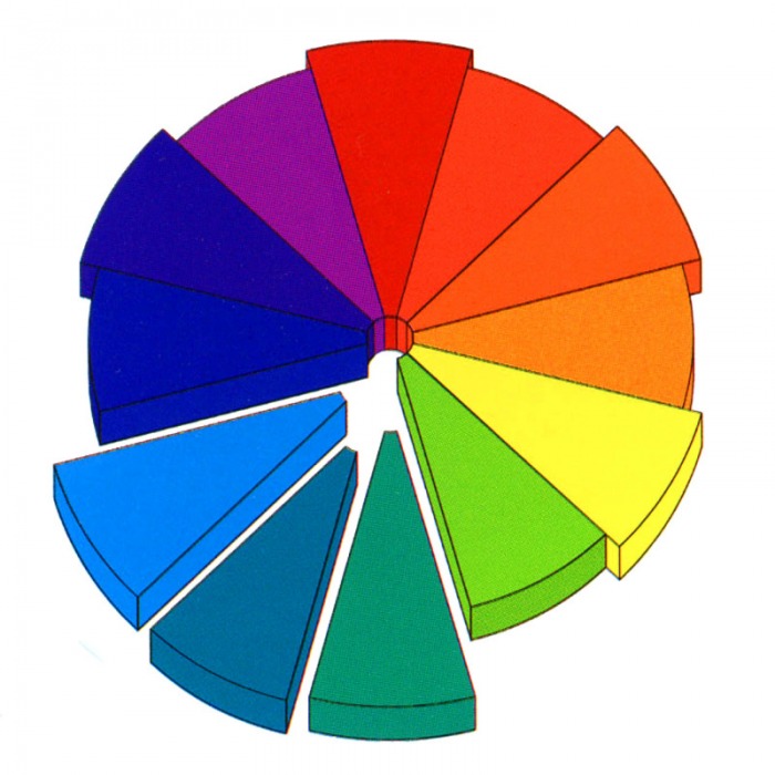
Basics of the Color Wheel
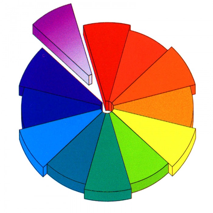
HueColor and hue are synonymous and can be used interchangeably. Red, yellow and blue are the primary colors. Green, orange and violet are the secondary colors and tertiary colors are a mixture of two secondary colors.
In order to loosely describe the colors on the color wheel, we can break them into two classifications. Warm colors & cool colors. Warm Colors consist of Red, orange & yellow. Cool colors consist of Green, blue & violet. |
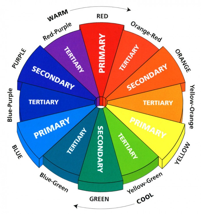 Click to enlarge |
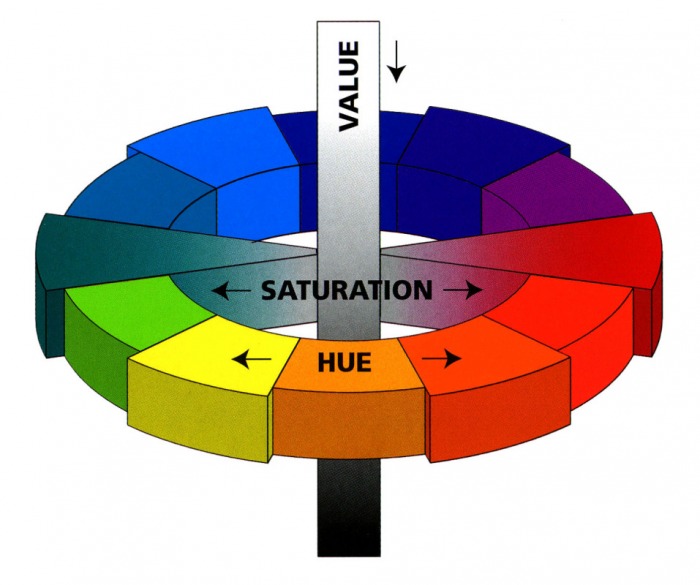
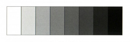
SaturationThe intensity of a color is described as saturation. Saturation is determined by how little or how much gray a color contains. In its purest form, a hue is at maximum saturation; these are colors that are not “grayed.” They are described as: clear, pure, brilliant, bright, rich, bold, vivid and/or true. The grayer or more neutral a color is, the less its saturation. Less saturated colors are described as soft, muted, subtle, toned-down, misty, dull or dusty.
|
 Click to enlarge |
ValueThe lightness or darkness of a color is called its value.
Lightened values are tints, darkened values are shades and medium value colors are described as midtones. The perception of a color is affected greatly by its value or saturation; in planning a color combination, value and saturation are as important as the hue. For example, in the red family, a darkened value of burgundy gives more power than a lighter value of rose pink. A vividly saturated turquoise is more exciting than a pale grayed aqua. |
 Click to enlarge |
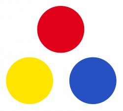
Primary ColorsPrimary colors refer to Red, Blue and Yellow. These three colors are the building blocks of the color wheel. From these three colors comes every other color that is on the color wheel, and cannot be made by combining any other colors. Primary colors are known for their vibrancy, and if you think about it, many types of design can be seen utilizing these colors to draw attention to themselves.
|
 |
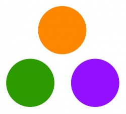
Secondary ColorsSecondary colors refer to Green, Orange, and Violet (purple). These three colors are located in between your primaries. This illustrates how in fact your secondary colors are created (ex. green is found in between yellow and blue, the two colors that comprise the makeup of green). These colors usually do not have the same vibrancy that are inherent in the primary colors.
|
 |
Tertiary ColorsThe tertiary colors are found in between the secondary colors and primary colors. Again, they are found in between the colors that are used to create and define them.
|
 Click to enlarge |
Color Schemes
MonotoneThe use of a single neutral color describes a monotone scheme. This includes light to medium grays, beiges, taupes and off-whites that will impart a calm, quiet quality.
|
 |
MonochromaticThe use of one color family in various values or intensities is called a monochromatic color scheme.
|
 Click to enlarge |
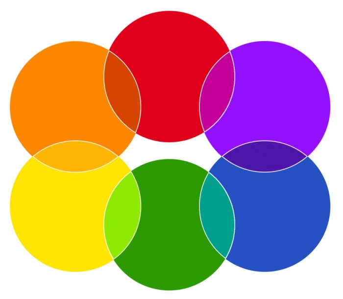
ComplementaryComplementary colors refer to colors that are opposite on the color wheel: purple & yellow, red & green, orange & blue (even though the graphic to the right looks like its pairing blue and yellow, its actually purple).
Complementary colors are used to create contrast as well as balance. Many times you will see the complementary color of another used in order to emphasize or highlight something in a certain design. An important thing to note as well is that Complementary colors will always consist of one warm and one cool color. |
 Click to enlarge |
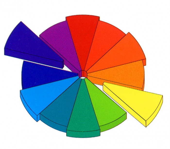
AnalogousAnalogous colors are neighboring families on the color wheel. If the combination spans only one-fourth of the color wheel, they are always harmonious as they share the same undertones, for example: blue, blue-green and green.
With analogous color schemes, it is possible for it to contain all cool or all warm colors, however, they can span them both...take for instance, blue, violet and red. |
 Click to enlarge |
Some of the terms are sourced from: Pantone: Guide to Communicating with Color, by Leatrice Eiseman
