teacher example
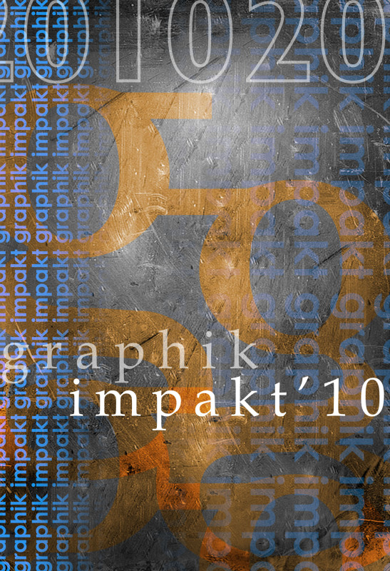
Notice the color usage here… the blue, pink and orange all come from the color sheet I did as an example for you in the previous color combination sheet project. Also, notice how I blended a texture into the background to contrast with the cleanliness of the font that I chose.
I used the letter ‘G’ in a different font to create a pattern by duplicating, and reflecting it, as well as changing the layer’s blending options… along with this, the words Graphik Impakt are used almost like tiles to create borders… REMEMBER, use the letters and the words as shapes and objects. You will want to make sure that somewhere on the poster, it clearly says Graphik Impakt 2010.
I used the letter ‘G’ in a different font to create a pattern by duplicating, and reflecting it, as well as changing the layer’s blending options… along with this, the words Graphik Impakt are used almost like tiles to create borders… REMEMBER, use the letters and the words as shapes and objects. You will want to make sure that somewhere on the poster, it clearly says Graphik Impakt 2010.
inspiration galleries... copy link into search bar
http://www.smashingmagazine.com/2008/05/12/sexy-bold-and-experimental-typography/
http://www.designflavr.com/resources/21-Inspirational-Typography-Artworks--from-DeviantArt-i116/
http://ilovetypography.com/2008/12/04/30-inspiring-type-treatments/
http://www.backtoessentials.com/inspiration/70-minimalist-typography-examples/
http://www.mrsandersclass.com/3/post/2010/02/graphik-impakt-2010-poster-designs.html
(these are the student examples from last year posted in the student spotlight)
