graphik impakt invite
In order for us to really start to look closer at just what makes a good batch of typography, we’re going to design the actual invites that will be going out for the Graphik Impakt Preview Event. Sounds pretty straight-forward enough right? Actually, this exercise (b/c it really isn’t in depth enough to be a project) is going to take some really detailed oriented eyes.
I am going to provide you with the text (or copy as it is sometimes known) that is absent of any grammatical structure. It will be your job to put a few of those laws into place that you read about in Meet Your Type. Let’s see what you come up with!
I am going to provide you with the text (or copy as it is sometimes known) that is absent of any grammatical structure. It will be your job to put a few of those laws into place that you read about in Meet Your Type. Let’s see what you come up with!
Many times when designing an invitation, you’ll see a designer use a program like Adobe Indesign. Because of our limited use of this program, I would suggest you use Illustrator (however if you want to give Indesign a try, it wouldn’t be a bad idea).
First create a document that measures 7 inches wide, and 5 inches tall. Using the text provided below, copy and paste it into a text box in Illustrator. Click here to download the Graphik Impakt header.
First create a document that measures 7 inches wide, and 5 inches tall. Using the text provided below, copy and paste it into a text box in Illustrator. Click here to download the Graphik Impakt header.
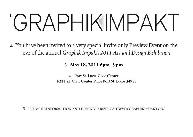
you have been invited to a very special invite only preview event on the eve of the annual graphik impakt 2011 art and design exhibition
may 18th 2011 6pm - 9pm
port st. lucie civic center, 9221 S.E. Civic Center Place, Port St. Lucie, FL 34952
For more information and to kindly rsvp, please visit www.graphikimpakt.org
may 18th 2011 6pm - 9pm
port st. lucie civic center, 9221 S.E. Civic Center Place, Port St. Lucie, FL 34952
For more information and to kindly rsvp, please visit www.graphikimpakt.org
Next, really look at what you have there. Can you break it down into types of information or categories….if you did, how many would you have? I’m going to include some key words here that you will want to think about addressing in your layout based on what you have understood from reading Meet Your Type:
Typeface
Font
Point Size
Serif vs. Sans Serif
Traditional Family
Extended Family
Text Face
Hierarchy
Flush Left, Right, Centered, Justified
Leading
Kerning
Letter Spacing
Why have I included each of these words here? Could they really ALL apply to something such as a simple invitation? The answer is yes—each one of these terms need to be addressed when creating the format, layout and look of your copy.
Specs.
Also, here are some tips when designing an invite...
Take your time with this! This kind of exercise takes a very detailed eye, patience, and a solid understanding of typography and its many sides (this is what we are hoping to understand better through this exercise). In the email that you send me to turn your work in, I want you to write a fully developed paragraph explaining to me the choices that you made with the text, and why you made those choices. Fully explain ALL of the choices that you made, even if you feel it is obvious. This process will help you talk about these rules and standards that so many people let go unnoticed.
Once you have finished, you may send me your illustrator file titled “my last name_invite.ai”
Typeface
Font
Point Size
Serif vs. Sans Serif
Traditional Family
Extended Family
Text Face
Hierarchy
Flush Left, Right, Centered, Justified
Leading
Kerning
Letter Spacing
Why have I included each of these words here? Could they really ALL apply to something such as a simple invitation? The answer is yes—each one of these terms need to be addressed when creating the format, layout and look of your copy.
Specs.
- Everyone’s invite will measure 7 X 5 inches
- Everyone’s text will be black
- The background of the invite will be white
- Everyone’s text will consist of only what I’ve included above
- Everyone should have at least a 1 inch margin around the inside of their invite (SET UP GUIDES)
Also, here are some tips when designing an invite...
- No hyphenation at the ends of lines
- We don’t need commas like you would see in a letter or essay
- Abbreviations do not require that you end them with periods
- Experiment with the different types of typefaces in a type family (for instance, is a there need for a line to be written in small caps)
- Look at your leading and kerning…now look back at Meet Your Type…how has your copy addressed these needs?
Take your time with this! This kind of exercise takes a very detailed eye, patience, and a solid understanding of typography and its many sides (this is what we are hoping to understand better through this exercise). In the email that you send me to turn your work in, I want you to write a fully developed paragraph explaining to me the choices that you made with the text, and why you made those choices. Fully explain ALL of the choices that you made, even if you feel it is obvious. This process will help you talk about these rules and standards that so many people let go unnoticed.
Once you have finished, you may send me your illustrator file titled “my last name_invite.ai”
model invite
Once you have completed and sent in your invite, refer to the model below. Identify the type settings and sizes in order to see what we were going for. Remember, we were looking for a classic look that was easy to read, and easy to discern different information. Nothing crazy—small differences only. I used the family Arno Pro because of its many different variations. Remember we spoke about the fact that using one family allows differences that work on “a united front.” The following settings were used in the invite below:
- District Thin, 34pt
- Arno Pro Regular, 16pt
- Arno Pro Bold, 14pt
- Arno Pro Semi Bold Display, 12pt
- Arno Pro Subhead Caps, 10pt